
Setup
This page sets out how to customize your App Drop-in UI to match the look and feel of your brand by creating an OrcaFlavor object:
- Specify the colors
- Set the fonts
- Localize the text
- Style the layout
The following is a complete example for Android and iOS:
import com.fourthline.networking.NetworkEnvironment.Sandbox
import com.fourthline.orca.core.flavor.OrcaFlavor
import com.fourthline.orca.core.flavor.OrcaFonts
import com.fourthline.orca.Orca
import com.fourthline.orca.workflow.WorkflowConfig
import com.fourthline.orca.workflow.WorkflowCustomizationConfig
import com.fourthline.orca.workflow.workflow
import java.io.File

// Generated by POST https://{{baseUrl}}/v1/workflows/{{workflowId}}/validationcode
val validationCode: String

// Choose `Mock` to test locally or `Sandbox`/`Production` for networking
val config = WorkflowConfig(networkEnvironment = Sandbox)

val customFlavor = OrcaFlavor(
    fonts = OrcaFonts(
        screenHeader = OrcaFonts.Font.FromFontRes(fontRes = R.font.roboto_medium, size = 20),
        primaryButton = OrcaFonts.Font.FromFile(file = File("..."), size = 18)
    )
)

val customizationConfig = WorkflowCustomizationConfig(flavor = customFlavor)

Orca.workflow(context, validationCode)
    .configure(config)
    .customize(customizationConfig)
.present { result -> }import FourthlineSDK
import UIKit
override func viewDidLoad() {
super.viewDidLoad()
var flavor = OrcaFlavor()
var palette = OrcaPalette()
palette.primary = UIColor(red: 82.0/255.0, green: 30.0/255.0, blue: 135.0/255.0, alpha: 1)
var colors = OrcaColors(colorPalette: palette)
colors.hint.backgroundColor = UIColor(red: 221.0/255.0, green: 210.0/255.0, blue: 232.0/255.0, alpha: 0.5)
colors.box.borderColor = .gray
colors.screen.tableCells.cellStyle2.iconColor = UIColor(red: 221.0/255.0, green: 210.0/255.0, blue: 3.0/255.0, alpha: 1)
flavor.colors = colors
let customization = WorkflowCustomizationConfig(flavor: flavor)
let configuration = WorkflowConfig(networkEnvironment: .mock)
// Generated by POST https://{{baseUrl}}/v1/workflows/{{workflowId}}/validationcode
let validationCode = "xxxxxxxx"
Orca.workflow(validationCode: validationCode)
.configure(with: configuration)
.customize(with: customization)
.present { [weak self] result in
switch result {
case let .failure(error): self?.handleError(error)
case .success: break
}
}
}Colors
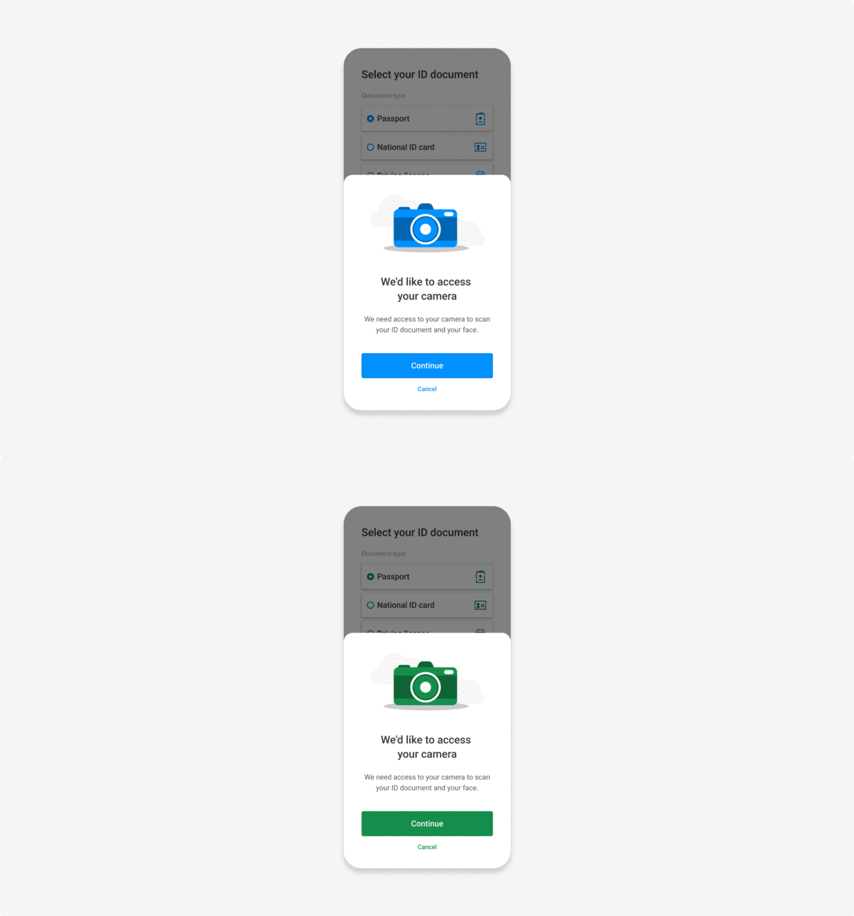
Set the colors in the UI:
Colors
You can define colors as follows:
| Property | Description |
|---|---|
| Color palette | |
primary | The color for illustrations and elements that require focus, e.g. buttons and inputs. This is the main color used in the app for e.g. animations, icons, primary button background, secondary button text, second option text primary button, scanner progress, table selectors, scanner checks, links. Light mode default: # 0091FF Dark mode default: # 7FB3FC |
accent | The color for UI elements that offer clients a choice. Light & dark mode default: # 00E062 |
dark | The very dark color palette, mainly used for the default heading color. Light mode default: # 333333 Dark mode default: # FFFFFF |
darkLight | The mid-dark color palette, mainly used for the default text color. Light mode default: # 585858 Dark mode default: # C3CDD8 |
darkLighter | The lightest-dark color palette, mainly used for the default alternative and less emphasis text color. Light mode default: # 878787 Dark mode default: # 3D5671 |
darkSoft | The soft dark color palette. Light mode default: # D6D6D6 Dark mode default: # 263444 |
light | The light color palette, mainly used for the default backgroundColor. Light mode default: # FFFFFF Dark mode default: # 172637 |
gray | The grey color palette. Light mode default: # B3B3B3 Dark mode default: # 607B93 |
| Property | Description |
|---|---|
| OrcaScreen | |
backgroundColor | The default backgroundColor for the drop-in screen. Light & dark mode default: light |
headerColor | The color for the screen header. Light & dark mode default: dark |
titleColor | The color for the screen title. Light & dark mode default: dark |
messageColor | The color for the screen message. Light & dark mode default: darkLight |
dividerColor | The color for the dividers. Light & dark mode default: darkLight |
tableCells | The color inside table cells. See OrcaCell 1 & 2. |
| Property | Description |
|---|---|
| OrcaCell 1 | |
cellStyle1 | The cell style for the document type screen document option. |
backgroundColor | The color for the background of cells. Light mode default: white Dark mode default: # 263444 |
textColor | The color for text in cells. Light mode default: # 333333 Dark mode default: white |
iconColor | The color for icons in cells. Light & dark mode default: primary |
borderColor | The color for the borders of cells. Light & dark mode default: clear |
dividerColor | The color for dividers between cells. Light & dark mode default: clear |
| OrcaCell 2 | |
cellStyle2 | The cell style for the documents to sign on the Document approval screen. |
backgroundColor | The color for the background of cells. Light mode default: white Dark mode default: # 263444 |
textColor | The color for the text in cells. Light & dark mode default: primary |
iconColor | The color for the icon of cells. Light & dark mode default: primary |
borderColor | The color for the borders of cells. Light mode default: black 10% Dark mode default: white 10% |
dividerColor | The color for dividers between cells. Light mode default: black 10% Dark mode default: white 30% |
| Property | Description |
|---|---|
| Buttons | |
primary.textColor | The primary button text color. Light & dark mode default: light |
primary.backgroundColor | The primary button background color. Light & dark mode default: primary |
primary.borderColor | The primary button border color. Light & dark mode default: black 10% |
secondary.textColor | The secondary button text color. Light & dark mode default: primary |
secondary.backgroundColor | The secondary button background color. Light & dark mode default: backgroundColor |
secondary.borderColor | The secondary button border color. Light & dark mode default: black 10% |
backButtonColor | The Back button text color. Light & dark mode default: primary |
scannerPrimary.textColor | The primary scanner button text color. Light & dark mode default: light |
scannerPrimary.backgroundColor | The primary scanner button background color. Light & dark mode default: primary |
scannerPrimary.borderColor | The primary scanner button border color. Light & dark mode default: black 10% |
scannerSecondary.textColor | The secondary scanner button text color used in the Scanner confirmation screen for the No button. Light mode default: primary Dark mode default: white |
scannerSecondary.backgroundColor | The secondary scanner button background color used in the Scanner confirmation screen for the No button. Light mode default: white Dark mode default: darkLighter |
scannerSecondary.borderColor | The secondary scanner button border color. Light & dark mode default: black 10% |
linkButtonColor | The color for links. Light & dark mode default: primary |
checkbox | The color for checkboxes. See OrcaCheckbox. |
| Property | Description |
|---|---|
| OrcaInputField | |
textColor | The color for input field text. Light & dark mode default: dark |
disabledTextColor | The color for input field text in disabled state. Light mode default: black 20% Dark mode default: white 20% |
placeholderColor | The color for input field placeholders. Light & dark mode default: dark 60% |
titleColor | The color for input field titles at the top and next to the field border. Light & dark mode default: darkLight |
statusColor | The color for hint messages below input fields. Light & dark mode default: darkLighter |
errorColor | The color for error messages below input fields. Light & dark mode default: danger |
backgroundColor | The background color for input fields. Light & dark mode default: backgroundColor |
disabledBackgroundColor | The background color for input fields in disabled state. Light mode default: dark 10% Dark mode default: white 40% |
borderColor | The unfocused border color for input fields. Light mode default: gray Dark mode default: darkLighter |
disabledBorderColor | The color for input field borders in disabled state. Light mode default: # B3B3B3 Dark mode default: darkLighter |
| Property | Description |
|---|---|
| OrcaScanner | |
confirmation | The colors for elements on the Scanner confirmation screen. See OrcaScannerConfirmation. |
spinnerColor | The color for loading animations in selfie and liveness scanner screens. Light & dark mode default: primary |
progressColor | The color for progress indicators in the document scanner screen. Light & dark mode default: primary |
| OrcaScannerConfirmation | |
textColor | The color for scanner confirmation text. Light & dark mode default: white |
backgroundColor | The background color for Scanner confirmation screens. Light mode default: # 333333 Dark mode default: # 172230 |
bulletList | The color for bullet lists. Light & dark mode default: primary |
| Property | Description |
|---|---|
| OrcaBox | |
backgroundColor | The default background color for boxes. Light mode default: # F7F7F7 Dark mode default: # 121C28 |
borderColor | The border color for boxes. Light mode default: black 10% Dark mode default: white 10% |
titleColor | The title color for boxes. Light & dark mode default: darkLight |
| OrcaCheckbox | |
tintColor | The primary checkbox color. Light & dark mode default: primary |
iconColor | The color for the checkmark icon. Light & dark mode default: light |
| OrcaGraphic | |
backgroundColor | The background color for introduction animations. Light mode default: # F3F3F3 Dark mode default: white 10% |
primaryColor | The color for animations in introduction screens. Light & dark mode default: primary |
| OrcaHint | |
textColor | The color for hint text. Light & dark mode default: dark |
backgroundColor | The color for hint backgrounds. Light mode default: # F3F9FF Dark mode default: # 3E586F |
borderColor | The color for hint component borders. Light & dark mode default: black 10% |
| OrcaPopup | |
backgroundColor | The background color for popups. Light & dark mode default: backgroundColor |
titleColor | The title color for popups. Light & dark mode default: dark |
messageColor | The color for messages in popups. Light & dark mode default: darkLight |
Android & iOS examples
Example code:
import com.fourthline.orca.core.flavor.OrcaColors
import com.fourthline.orca.core.flavor.OrcaColors.OrcaColor
import com.fourthline.orca.core.flavor.OrcaFlavor

val customFlavor = OrcaFlavor(
    colorsDark = OrcaColors.defaultDarkColors().apply {
      buttons.primary.backgroundColor = OrcaColor.FromRes(R.color.colorPrimary)
      popup.backgroundColor = OrcaColor.FromInt(0xEEEEEE)
    }
)

// Usage
import com.fourthline.orca.Orca
import com.fourthline.orca.[product].[Product]CustomizationConfig
import com.fourthline.orca.[product].[product]

val customizationConfig = [Product]CustomizationConfig(flavor = customFlavor)

Orca.[product](context)
  ...
  .customize(config = customizationConfig)
...var flavor = OrcaFlavor()
var colorPalette = OrcaPalette()
colorPalette.primary = .black
flavor.colors = OrcaColors(colorPalette: colorPalette)
// Update the colors of the primary button
flavor.colors.buttons.primary.backgroundColor = .yellow
flavor.colors.buttons.primary.textColor = .black
flavor.colors.buttons.primary.borderColor = .lightGray
// Update the colors of the popup
flavor.colors.popup.backgroundColor = .blue
flavor.colors.popup.titleColor = .white
flavor.colors.popup.messageColor = .white
// Add to the Orca Kyc builder
let configuration = KycConfig(supportedCountries: localDataSource.supportedCountries)
let customization = KycCustomizationConfig(flavor: flavor)
Orca.kyc
.configure(with: configuration)
.customize(with: customization)
.present { result in
switch result {
case .success(let kycInfo):
print("Finished Orca with kyc info: \(kycInfo)")
case let .failure(kycError):
print("Finished Orca with error: \(kycError)")
}iOS dark mode support
iOS 13 supports dark mode. You can optimize colors for dark mode:
Either programmatically:
init(dynamicProvider: @escaping (UITraitCollection) -> UIColor)Or using iOS Assets:
- Create a new color set from Assets.
- In the inspector panel, change Appearance to Dark mode.
- You can set 2 colors.
If initializing the drop-in with dynamic colors, dark mode is automatically supported.
Plugin examples
Example configuration JSON:
{
  "fonts": Orca Fonts Json,
  "colors": Orca Colors Json,
  "localization": Orca Localization Json,
  "layouts": Orca Layouts Json
}- All colors are optional and if not set, the default is used.
- Specify colors in hex format.
- Start hex strings with the hash symbol followed by 6 digits: #FFFFFF
- To add color transparency, change the hex code format from #RRGGBB to #AARRGGBB where alpha is
AA: #800080FF is blue with alpha value set to 80. - You can only use 3-digit hex codes if the RR, GG, and BB values are the same for each component. Write #FF00CC as #F0C.
Color format
{
  "colorsLight": ColorConfiguration,
  "colorsDark": ColorConfiguration
}colorsDarkis optional.- iOS 13 and Android 11.0 support dark mode. To customize colors for dark mode, set values for
colorsDark.
Color configuration
{
  "screen": {
    "backgroundColor": String,
    "headerColor": String,
    "titleColor": String,
    "messageColor": String,
    "dividerColor": String,
    "tableCells":{
      "cellStyle1":{
        "backgroundColor": String,
        "textColor": String,
        "iconColor": String,
        "borderColor": String,
        "dividerColor": String
      },
      "cellStyle2":{
        "backgroundColor": String,
        "textColor": String,
        "iconColor": String,
        "borderColor": String,
        "dividerColor": String
      }
    }
  },
  "buttons": {
    "primary": {
      "textColor": String,
      "backgroundColor": String,
      "borderColor": String
    },
    "secondary": {
      "textColor": String,
      "backgroundColor": String,
      "borderColor": String
    },
    "scannerPrimary": {
      "textColor": String,
      "backgroundColor": String,
      "borderColor": String
    },
    "scannerSecondary": {
      "textColor": String,
      "backgroundColor": String,
      "borderColor": String
    },
    "checkbox": {
      "tintColor": String,
      "iconColor": String
    },
    "backButtonColor": String,
    "linkButtonColor": String
  },
  "inputField": {
    "textColor": String,
    "placeholderColor": String,
    "titleColor": String,
    "statusColor": String,
    "errorColor": String,
    "backgroundColor": String,
    "disabledBorderColor": String,
    "disabledTextColor": String,
    "disabledBackgroundColor": String,
    "borderColor": String
  },
  "palette": {
    "dark": String,
    "gray": String,
    "light": String,
    "darkSoft": String,
    "darkLighter": String,
    "accent": String,
    "primary": String,
    "darkLight": String
  },
  "hint": {
    "textColor": String,
    "backgroundColor": String,
    "borderColor": String
  },
  "popup": {
    "titleColor": String,
    "messageColor": String,
    "backgroundColor": String
  },
  "scanner": {
    "spinnerColor": String,
    "progressColor": String,
    "confirmation": {
      "textColor": String
      "backgroundColor": String,
      "bulletListColor": String
    }
  },
  "graphic": {
    "primaryColor": String,
    "backgroundColor": String
  },
  "box": {
    "titleColor": String,
    "backgroundColor": String,
    "borderColor": String
  }
}
Example code:
var colors = `{
  "colorsLight": {
    "screen": {
      "headerColor": "#333333",
      "titleColor": "#333333",
      "messageColor": "#585858",
      "backgroundColor": "#FFFFFF",
      "dividerColor": "#000000",
      "tableCells":{
        "cellStyle1":{
            "backgroundColor":"#FFFFFF",
            "textColor":"#333333",
            "iconColor":"#04A1BD",
            "borderColor":"#FFFFFF",
            "dividerColor":"#FFFFFF"
          }
        }
    }
  }
}`

var config = `{
  "flowType": "defaultFlow",
  "configuration": {
    "flavor": {
      "colors": ${colors}
    }
  }
}`

Fourthline.startKyc(
    config,
    function(kycJson) {
      // Extract and process information from the result String received in JSON format
      var jsonResult = JSON.parse(kycJson);
    },
    function(error) {
      // Extract and process information from the error String received in JSON format
      var jsonError = JSON.parse(error);
    }
);String colors = """
{
"colorsLight": {
"screen": {
"headerColor": "#333333",
"titleColor": "#333333",
"messageColor": "#585858",
"backgroundColor": "#FFFFFF",
"dividerColor": "#000000",
"tableCells":{
"cellStyle1":{
"backgroundColor":"#FFFFFF",
"textColor":"#333333",
"iconColor":"#04A1BD",
"borderColor":"#FFFFFF",
"dividerColor":"#FFFFFF"
}
}
}
}
}
"""
String config = """
{
"flowType": "customFlow",
"configuration": {
"flowSteps": ["selfieFlow", "addressFlow"],
"flavor": {
"colors": $colors
}
}
}
"""
try {
String result = await _fourthlinePlugin.startKyc(config) ?? "Could not start Kyc";
// Extract and process information from the result String received in JSON format
print('The success response is: $result');
} on PlatformException catch (e) {
// Extract and process information from the error
String error = e.toString();
};
// Instance variable defined in your Dart class.
final _fourthlinePlugin = Fourthline();import { NativeModules } from 'react-native'
var colors = `{
"colorsLight": {
"screen": {
"headerColor": "#333333",
"titleColor": "#333333",
"messageColor": "#585858",
"backgroundColor": "#FFFFFF",
"dividerColor": "#000000",
"tableCells":{
"cellStyle1":{
"backgroundColor":"#FFFFFF",
"textColor":"#333333",
"iconColor":"#04A1BD",
"borderColor":"#FFFFFF",
"dividerColor":"#FFFFFF"
}
}
}
}
}`
var config = `{
"flowType": "defaultFlow",
"configuration": {
"flavor": {
"colors": ${colors}
}
}
}`;
NativeModules.Fourthline.startKyc(config)
.then((kycJson) => {
// Extract and process information from the result String received in JSON format
var jsonResult = JSON.parse(kycJson);
})
.catch((error) => {
// Extract and process information from the error String received in JSON format
var jsonError = JSON.parse(error.message);
});Fonts
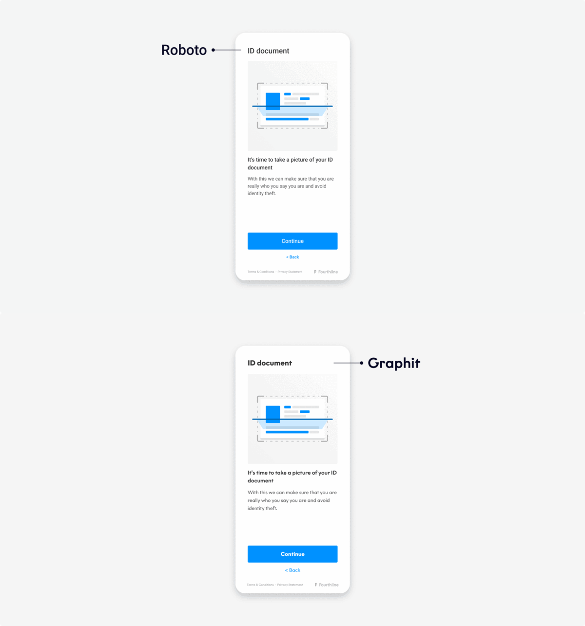
Set the fonts in the UI:
Fonts
You can define fonts as follows:
| Property | Description |
|---|---|
screenHeader | The main heading on screens. Default: Roboto-Medium 24 |
screenTitle | The subtitle on screens. Default: Roboto-Medium 18 |
screenMessage | The description of the screen. Default: Roboto-Regular 16 |
primaryButton | The font for the primary button. Default: Roboto-Medium 18 |
secondaryButton | The font for the secondary button. Default: Roboto-Medium 14 |
inputField | The font for input fields. Default: Roboto-Medium 18 |
inputFieldPlaceholder | The font for input field placeholders. Default: Roboto-Medium 18 |
inputFieldTitle | The font for input field headings and titles. Default: Roboto-Medium 14 |
inputFieldStatus | The font for input field errors and hints. Default: Roboto-Medium 12 |
scannerInstructionText | The font for scanner instructions. Default: Roboto-Medium 20 |
confirmationScreenTitle | The font for the title of confirmation screens. Default: Roboto-Medium 20 |
confirmationScreenCheckpoints | The font for checkpoints on confirmation screens. Default: Roboto 16 |
tableElementTitle | The font for titles of table view elements. Default: Roboto-Medium 16 |
tableElementDescription | The font for descriptions of table view elements. Default: Roboto 14 |
instructionsLink | The font for linked instructions buttons. Default: Roboto-Medium 14 |
hintText | The font for hint text beneath input fields. Default: Roboto-Regular 14 |
popupHeader | The font for headings on popup screens. Default: Roboto-Medium 24 |
popupMessage | The font for message text on popup screens. Default: Roboto 16 |
popupTitle | The font for error text on popup screens. Default: Roboto-Medium 18 |
Android & iOS examples
Example code:
import com.fourthline.orca.core.flavor.OrcaFlavor
import com.fourthline.orca.core.flavor.OrcaFonts

val customFlavor = OrcaFlavor(
    fonts = OrcaFonts(
        screenHeader = OrcaFonts.Font.FromFontRes(fontRes = R.font.roboto_medium, size = 20),
        primaryButton = OrcaFonts.Font.FromFile(file = File(...), size = 18),
    )
)

val customizationConfig = [Product]CustomizationConfig(flavor = customFlavor)

Orca.[product](context)
  ...
  .customize(config = customizationConfig)
...var flavor = OrcaFlavor()
flavor.fonts.screenHeader = UIFont(name: "Roboto-Medium", size: 22)!
flavor.fonts.primaryButton = UIFont(name: "Roboto-Regular", size: 20)!
// Add to the Orca Kyc builder
let configuration = KycConfig(supportedCountries: localDataSource.supportedCountries)
let customization = KycCustomizationConfig(flavor: flavor)
Orca.kyc
.configure(with: configuration)
.customize(with: customization)
.present { result in
switch result {
case .success(let kycInfo):
print("Finished Orca with kyc info: \(kycInfo)")
case let .failure(kycError):
print("Finished Orca with error: \(kycError)")
}Plugin examples
Example configuration JSON:
{
  "fonts": Orca Fonts Json,
  "colors": Orca Colors Json,
  "localization": Orca Localization Json,
  "layouts": Orca Layouts Json
}- The font name you set in
OrcaFlavormust match the one defined in the font file metadata (without the file extension). - Android: Add the otf/ttf font files to the Android project asset folder.
- iOS: Add the custom font files to both the iOS project folder and the application's
Info.plistfile. - All drop-in elements are optional and if not set, the default is used.
{
  "orcaElementName": {
    "fontName": String,
    "fontSize": Int
  }
}
Example code:
var orcaFonts = `{
  "screenHeader": {
    "fontName": "Avenir-Medium",
    "fontSize": 24
  },
  "screenTitle": {
    "fontName": "Poppins-Regular",
    "fontSize": 18
  },
  "screenMessage": {
    "fontName": "Poppins-Regular",
    "fontSize": 16
  },
  "primaryButton": {
    "fontName": "Avenir-Medium",
    "fontSize": 16
  },
  "secondaryButton": {
    "fontName": "Poppins-Regular",
    "fontSize": 16
  },
  "instructionsLink": {
    "fontName": "Avenir-Light",
    "fontSize": 14
  },
  "hintText": {
    "fontName": "Avenir-Light",
    "fontSize": 14
  },
  "inputField": {
    "fontName": "Avenir-Light",
    "fontSize": 18
  },
  "inputFieldPlaceholder": {
    "fontName": "Avenir-Light",
    "fontSize": 18
  },
  "inputFieldTitle": {
    "fontName": "Avenir-Medium",
    "fontSize": 14
  },
  "inputFieldStatus": {
    "fontName": "Avenir-Light",
    "fontSize": 14
  },
  "scannerInstructionText": {
    "fontName": "Avenir-Medium",
    "fontSize": 20
  },
  "confirmationScreenTitle": {
    "fontName": "Avenir-Medium",
    "fontSize": 20
  },
  "confirmationScreenCheckpoints": {
    "fontName": "Avenir-Medium",
    "fontSize": 16
  },
  "tableElementTitle": {
    "fontName": "Avenir-Light",
    "fontSize": 18
  },
  "tableElementDescription": {
    "fontName": "Avenir-Light",
    "fontSize": 14
  },
  "popupHeader": {
    "fontName": "Avenir-Medium",
    "fontSize": 18
  },
  "popupTitle": {
    "fontName": "Avenir-Light",
    "fontSize": 18
  },
  "popupMessage": {
    "fontName": "Avenir-Light",
    "fontSize": 16
  }
}
`

var config = `{
  "flowType": "defaultFlow",
  "configuration": {
    "flavor": {
      "fonts": ${orcaFonts}
    }
  }
}`;

Fourthline.startKyc(
    config,
    function(kycJson) {
      // Extract and process information from the result String received in JSON format
      var jsonResult = JSON.parse(kycJson);
    },
    function(error) {
      // Extract and process information from the error String received in JSON format
      var jsonError = JSON.parse(error);
    }
);
String orcaFonts = """
{
  "screenHeader": {
    "fontName": "Avenir-Medium",
    "fontSize": 24
  },
  "screenTitle": {
    "fontName": "Poppins-Regular",
    "fontSize": 18
  },
  "screenMessage": {
    "fontName": "Poppins-Regular",
    "fontSize": 16
  },
  "primaryButton": {
    "fontName": "Avenir-Medium",
    "fontSize": 16
  },
  "secondaryButton": {
    "fontName": "Poppins-Regular",
    "fontSize": 16
  },
  "instructionsLink": {
    "fontName": "Avenir-Light",
    "fontSize": 14
  },
  "hintText": {
    "fontName": "Avenir-Light",
    "fontSize": 14
  },
  "inputField": {
    "fontName": "Avenir-Light",
    "fontSize": 18
  },
  "inputFieldPlaceholder": {
    "fontName": "Avenir-Light",
    "fontSize": 18
  },
  "inputFieldTitle": {
    "fontName": "Avenir-Medium",
    "fontSize": 14
  },
  "inputFieldStatus": {
    "fontName": "Avenir-Light",
    "fontSize": 14
  },
  "scannerInstructionText": {
    "fontName": "Avenir-Medium",
    "fontSize": 20
  },
  "confirmationScreenTitle": {
    "fontName": "Avenir-Medium",
    "fontSize": 20
  },
  "confirmationScreenCheckpoints": {
    "fontName": "Avenir-Medium",
    "fontSize": 16
  },
  "tableElementTitle": {
    "fontName": "Avenir-Light",
    "fontSize": 18
  },
  "tableElementDescription": {
    "fontName": "Avenir-Light",
    "fontSize": 14
  },
  "popupHeader": {
    "fontName": "Avenir-Medium",
    "fontSize": 18
  },
  "popupTitle": {
    "fontName": "Avenir-Light",
    "fontSize": 18
  },
  "popupMessage": {
    "fontName": "Avenir-Light",
    "fontSize": 16
  }
}
""";

String config = """
{
  "flowType": "customFlow",
  "configuration": {
    "flowSteps": ["selfieFlow", "addressFlow"],
    "flavor": {
      "fonts": $orcaFonts
    }
  }
}
""";

try {
  String result = await _fourthlinePlugin.startKyc(config) ?? "Could not start Kyc";
  // Extract and process information from the result String received in JSON format
  print('The success response is: $result');
} on PlatformException catch (e) {
  // Extract and process information from the error
  String error = e.toString();
};

// Instance variable defined in your Dart class.
final _fourthlinePlugin = Fourthline();import { NativeModules } from 'react-native'
var orcaFonts = `{
"screenHeader": {
"fontName": "Avenir-Medium",
"fontSize": 24
},
"screenTitle": {
"fontName": "Poppins-Regular",
"fontSize": 18
},
"screenMessage": {
"fontName": "Poppins-Regular",
"fontSize": 16
},
"primaryButton": {
"fontName": "Avenir-Medium",
"fontSize": 16
},
"secondaryButton": {
"fontName": "Poppins-Regular",
"fontSize": 16
},
"instructionsLink": {
"fontName": "Avenir-Light",
"fontSize": 14
},
"hintText": {
"fontName": "Avenir-Light",
"fontSize": 14
},
"inputField": {
"fontName": "Avenir-Light",
"fontSize": 18
},
"inputFieldPlaceholder": {
"fontName": "Avenir-Light",
"fontSize": 18
},
"inputFieldTitle": {
"fontName": "Avenir-Medium",
"fontSize": 14
},
"inputFieldStatus": {
"fontName": "Avenir-Light",
"fontSize": 14
},
"scannerInstructionText": {
"fontName": "Avenir-Medium",
"fontSize": 20
},
"confirmationScreenTitle": {
"fontName": "Avenir-Medium",
"fontSize": 20
},
"confirmationScreenCheckpoints": {
"fontName": "Avenir-Medium",
"fontSize": 16
},
"tableElementTitle": {
"fontName": "Avenir-Light",
"fontSize": 18
},
"tableElementDescription": {
"fontName": "Avenir-Light",
"fontSize": 14
},
"popupHeader": {
"fontName": "Avenir-Medium",
"fontSize": 18
},
"popupTitle": {
"fontName": "Avenir-Light",
"fontSize": 18
},
"popupMessage": {
"fontName": "Avenir-Light",
"fontSize": 16
}
}
`;
var config = `{
"flowType": "defaultFlow",
"configuration": {
"flavor": {
"fonts": ${orcaFonts}
}
}
}`;
NativeModules.Fourthline.startKyc(config)
.then((kycJson) => {
// Extract and process information from the result String received in JSON format
var jsonResult = JSON.parse(kycJson);
})
.catch((error) => {
// Extract and process information from the error String received in JSON format
var jsonError = JSON.parse(error.message);
});Localization
The UI can be configured in the following languages:
| Language | Locale | Formality |
|---|---|---|
| English (default) | en | informal |
| Bulgarian | bg | formal |
| Croatian | hr | informal |
| Czech | cs | informal |
| Danish | da | formal |
| Dutch | nl | formal, informal |
| Estonian | et | formal |
| Finnish | fi | informal |
| Flemish | vl | informal |
| French | fr | formal |
| German | de | formal |
| Greek | el | formal |
| Italian | it | informal |
| Polish | pl | informal |
| Portuguese | pt | formal |
| Maltese | mt | formal |
| Norwegian (Bokmål) | nb | formal |
| Romanian | ro | formal |
| Slovak | sk | informal |
| Spanish | es | informal |
| Turkish | tr | formal |
If the client's device language:
- Is supported: It is used automatically or you can override it with
flavor.localization.fixedLanguage. - Is not supported: Specify a fallback with
flavor.localization.baseLanguage.
You can't configure the level of language formality for the iOS & Android SDK's
Android & iOS (quick reference)
Android quick reference
| Topic | API / Path | Example / Notes |
|---|---|---|
| Set fallback language | OrcaFlavor(localization = OrcaLocalization(baseLanguage = OrcaLocalization.LanguageType.NL)) | Dutch (NL) fallback when device language isn’t supported. |
| Force specific language | OrcaLocalization(fixedLanguage = OrcaLocalization.LanguageType.ES) | Always Spanish (ES). |
| Apply flavor to product | [Product]CustomizationConfig(flavor = customFlavor) | Replace [Product]/[product] with your module (e.g., KycCustomizationConfig). |
| Usage (builder) | Orca.[product](context).customize(config = customizationConfig) | Add .customize(...) in your builder chain. |
iOS quick reference
| Topic | API / Path | Example / Notes |
|---|---|---|
| Force specific language | flavor.localization.fixedLanguage = .es | Always Spanish (ES). |
| Set fallback language | flavor.localization.baseLanguage = .nl | Uses Dutch (NL) when device language isn’t supported. |
| Apply flavor to product | let customization = KycCustomizationConfig(flavor: flavor) | Use the corresponding customization config for your flow. |
| Usage (builder) | Orca.kyc.configure(...).customize(with: customization).present { ... } | Add .customize(with:) in your builder chain. |
Plugins quick reference
| SDK | JSON key path | Example JSON |
|---|---|---|
| Shared | flavor.localization | { "baseLanguage": "fr", "fixedLanguage": "en" } |
| Cordova | Fourthline.startKyc(config) | See code tabs below. |
| Flutter | _fourthlinePlugin.startKyc(config) | See code tabs below. |
| React Native | NativeModules.Fourthline.startKyc(config) | See code tabs below. |
Copyable code (Android / iOS tabs)
import com.fourthline.orca.core.flavor.OrcaFlavor
import com.fourthline.orca.core.flavor.OrcaLocalization
// Optional: import com.fourthline.orca.Orca
// Optional: import com.fourthline.orca.[product].[Product]CustomizationConfig

val customFlavor = OrcaFlavor(
    localization = OrcaLocalization(
        baseLanguage = OrcaLocalization.LanguageType.NL
        // fixedLanguage = OrcaLocalization.LanguageType.ES
    )
)

// Usage (replace [product]/[Product] with your integration)
val customizationConfig = [Product]CustomizationConfig(flavor = customFlavor)

Orca.[product](context)
  // ...
  .customize(config = customizationConfig)
// ...var flavor = OrcaFlavor()
// Force a specific language:
flavor.localization.fixedLanguage = .es
// Or only set a fallback:
// flavor.localization.baseLanguage = .nl
let configuration = KycConfig(supportedCountries: localDataSource.supportedCountries)
let customization = KycCustomizationConfig(flavor: flavor)
Orca.kyc
.configure(with: configuration)
.customize(with: customization)
.present { result in
switch result {
case .success(let kycInfo):
print("Finished Orca with kyc info: \(kycInfo)")
case let .failure(kycError):
print("Finished Orca with error: \(kycError)")
}
}Plugin code
const orcaLocalization = `{
  "baseLanguage": "fr",
  "fixedLanguage": "en"
}`;

const config = `{
  "flowType": "defaultFlow",
  "configuration": {
    "flavor": {
      "localization": ${orcaLocalization}
    }
  }
}`;

Fourthline.startKyc(
  config,
  function (kycJson) {
    const jsonResult = JSON.parse(kycJson);
  },
  function (error) {
    const jsonError = JSON.parse(error);
  }
);import 'package:flutter/services.dart';
final Fourthline _fourthlinePlugin = Fourthline();
final String orcaLocalization = '{"baseLanguage": "fr", "fixedLanguage": "en"}';
final String config = """
{
"flowType": "customFlow",
"configuration": {
"flowSteps": ["selfieFlow", "addressFlow"],
"flavor": {
"localization": $orcaLocalization
}
}
}
""";
try {
final String result =
await _fourthlinePlugin.startKyc(config) ?? "Could not start KYC";
print('The success response is: $result');
} on PlatformException catch (e) {
final String error = e.toString();
}import { NativeModules } from 'react-native';
const orcaLocalization = `{
"baseLanguage": "fr",
"fixedLanguage": "en"
}`;
const config = `{
"flowType": "defaultFlow",
"configuration": {
"flavor": {
"localization": ${orcaLocalization}
}
}
}`;
NativeModules.Fourthline.startKyc(config)
.then((kycJson) => {
const jsonResult = JSON.parse(kycJson);
})
.catch((error) => {
const jsonError = JSON.parse(error.message);
});Layout
Set the corner radius for primary buttons:
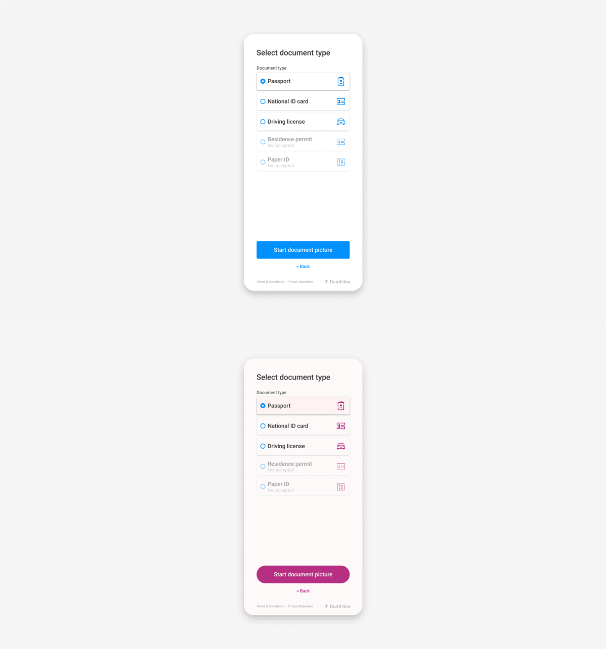
You can set the corner radius as follows:
| Property | Description |
|---|---|
primaryButtonCornerRadius | The corner radius for primary buttons. |
Android & iOS examples
Example code:
import com.fourthline.orca.core.flavor.OrcaFlavor
import com.fourthline.orca.core.flavor.OrcaLayouts

val customFlavor = OrcaFlavor(
    layouts = OrcaLayouts(primaryButtonCornerRadius = 0) // Rectangular buttons
    // layouts = OrcaLayouts(primaryButtonCornerRadius = 8) // Corner radius = 8 dp
    // layouts = OrcaLayouts(primaryButtonCornerRadius = OrcaLayouts.Round) // Fully rounded
)

// Usage
import com.fourthline.orca.Orca
import com.fourthline.orca.[product].[Product]CustomizationConfig
import com.fourthline.orca.[product].[product]

val customizationConfig = [Product]CustomizationConfig(flavor = customFlavor)

Orca.[product](context)
  // ...
  .customize(config = customizationConfig)
// ...var flavor = OrcaFlavor()
flavor.layouts.primaryButtonCornerRadius = .zero // Rectangular buttons
// flavor.layouts.primaryButtonCornerRadius = 8 // Corner radius = 8
// flavor.layouts.primaryButtonCornerRadius = OrcaLayout.CornerRadius.round // Fully rounded
// Add to the Orca KYC builder
Orca
.builder
.withDefaultFlow()
.addDataSource(localDataSource)
.addFlavor(flavor)
.present { completionReason in
switch completionReason {
case .completed(let kycInfo):
print("Finished Orca with kyc info: \(kycInfo)")
default:
break
}
}Plugin examples
Example configuration JSON:
{
  "primaryButtonCornerRadius": 0
}
primaryButtonCornerRadius can have the following values:
- -1: Fully rounded button
- ≥ 0: Corner radius equal to the value
Example code:
var orcaLayout = `{
  "primaryButtonCornerRadius": 8
}`;
var config = `{
  "flowType": "defaultFlow",
  "configuration": {
    "flavor": {
      "layouts": ${orcaLayout}
    }
  }
}`;
Fourthline.startKyc(
  config,
  function (kycJson) {
    var jsonResult = JSON.parse(kycJson);
  },
  function (error) {
    var jsonError = JSON.parse(error);
  }
);String orcaLayout = '{"primaryButtonCornerRadius": 8}';
String config = """
{
"flowType": "customFlow",
"configuration": {
"flowSteps": ["selfieFlow", "addressFlow"],
"flavor": {
"layouts": $orcaLayout
}
}
}
""";
try {
String result = await _fourthlinePlugin.startKyc(config) ?? "Could not start Orca";
print('The success response is: $result');
} on PlatformException catch (e) {
String error = e.toString();
}
// Instance variable defined in your Dart class
final _fourthlinePlugin = Fourthline();import { NativeModules } from 'react-native';
var orcaLayout = `{
"primaryButtonCornerRadius": 8
}`;
var config = `{
"flowType": "defaultFlow",
"configuration": {
"flavor": {
"layouts": ${orcaLayout}
}
}
}`;
NativeModules.Fourthline.startKyc(config)
.then((kycJson) => {
var jsonResult = JSON.parse(kycJson);
})
.catch((error) => {
var jsonError = JSON.parse(error.message);
});